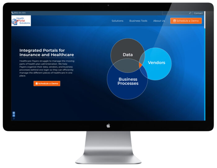
SaaS Tech Company Website
Overview
The HPS website was in need of an update. Frankly, since I started working as a freelancer for this company, I was salivating at the chance to redo this website. The company was well established, but using a $50 WordPress theme. It was driving me crazy. I also felt confused as to what the company did by looking at the website.
So with that being said, I wanted to make sure to design a website that actually said what the company did in clear and plain language. I also wanted to use custom graphics to communicate the value of the company, and illustrate the abstract concepts of the technology produced by this company.
I took my first shot at designing the homepage mock-up, and subsequent pages.
Upon showing the mock-up to the Marketing Director, the design went through some phases of edits. Finally, the mock-up was approved by the CEO, so I went to work to custom code the HPS theme based off my boiler plate theme. I really wanted to make sure the website looked high-end and tech savvy, so I made sure to add in custom animate graphics where I could; for instance, the bubbles on the homepage slowly grew and spun around. Sure, there were plenty of places for easy-peazy animations like fade-ins, but I wanted there to be no mistake that this was a tech company website.
I made sure to add custom graphics to the secondary pages too. I did recycle some graphics, but I wanted to put enough diversity into the pages with graphics too. I made sure the graphics always enhanced the message of the page, rather than distract. I was also able to re-use many of these graphics on other HPS assets. Below are some examples. The custom graphics helped give the company a unique edge, and made sure the imagery was on point (VS a generic stock image).
Services


