BMA Corporate Style Guide
Overview
I had created a few different designs for this company, sales sheets, brochures, and their website.
The company had a lot of staff changes and somehow they often tasked account managers and salespeople with designing graphics. Often times, far out fonts, colors, and poor quality photography were used. Previously, the company’s style guide was a single sheet of paper, which is why the company graphics were so exploratory.
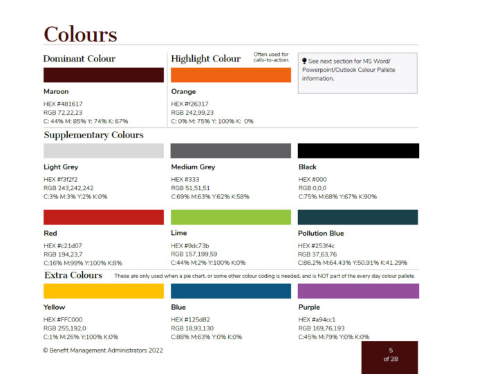
I certainly wanted to make sure that all assets were cohesive, and helped to elevate the brand. I wanted to make sure the brand name communicated value, and when seen, trust could be felt. Therefore I designed a style guide. I made this one very detailed. I made sure to go into detail on how assets should be used, and not used. Beyond just including “designer” terms, I illustrated concepts and created design templates for non-designers as part of the package.
Well, just page through the document; I think it’ll speak for itself.
Services
