Grievances and Appeals UI
Overview
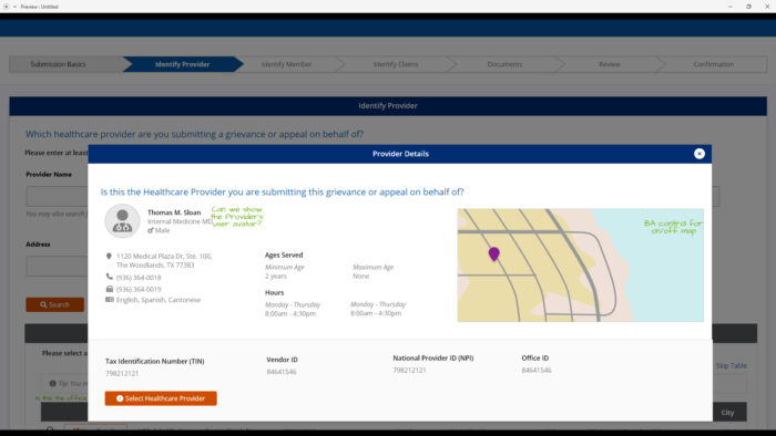
This was a new feature added to the product this year. One of the business analyst put out a first draft of the UI quickly, but I wanted to update the UI to meet out design standards, WCAG, and be more intuitive, so I re-designed this UI.
I added a lot more instructions and tips into the page. I also made sure to ask the questions in plain words, and un-acronymize the words in the inputs.
In the design, you will see two alternative views for the Select a Provider UI. I first stuck closer to the developed UI as an option, but then I did a version of the design that I thought would be easier to understand, but would take more development time.
Overall, I think this UI speaks for itself, so go ahead and have a look.
https://xd.adobe.com/view/b9014c29-6e49-4db4-9404-5adf30e0a62d-ec52/?fullscreen
Services
prototyping / UI/UX / XD

