HPS Member Portal Home Screens
Overview
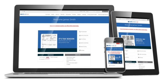
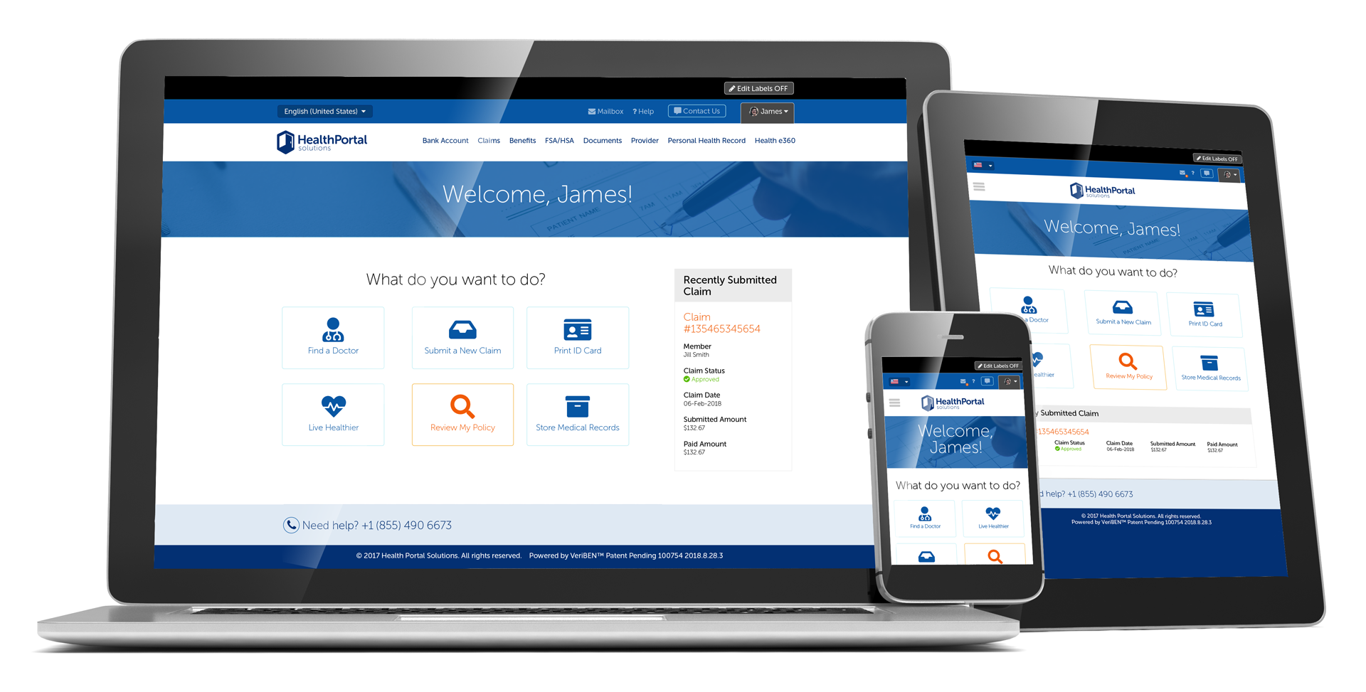
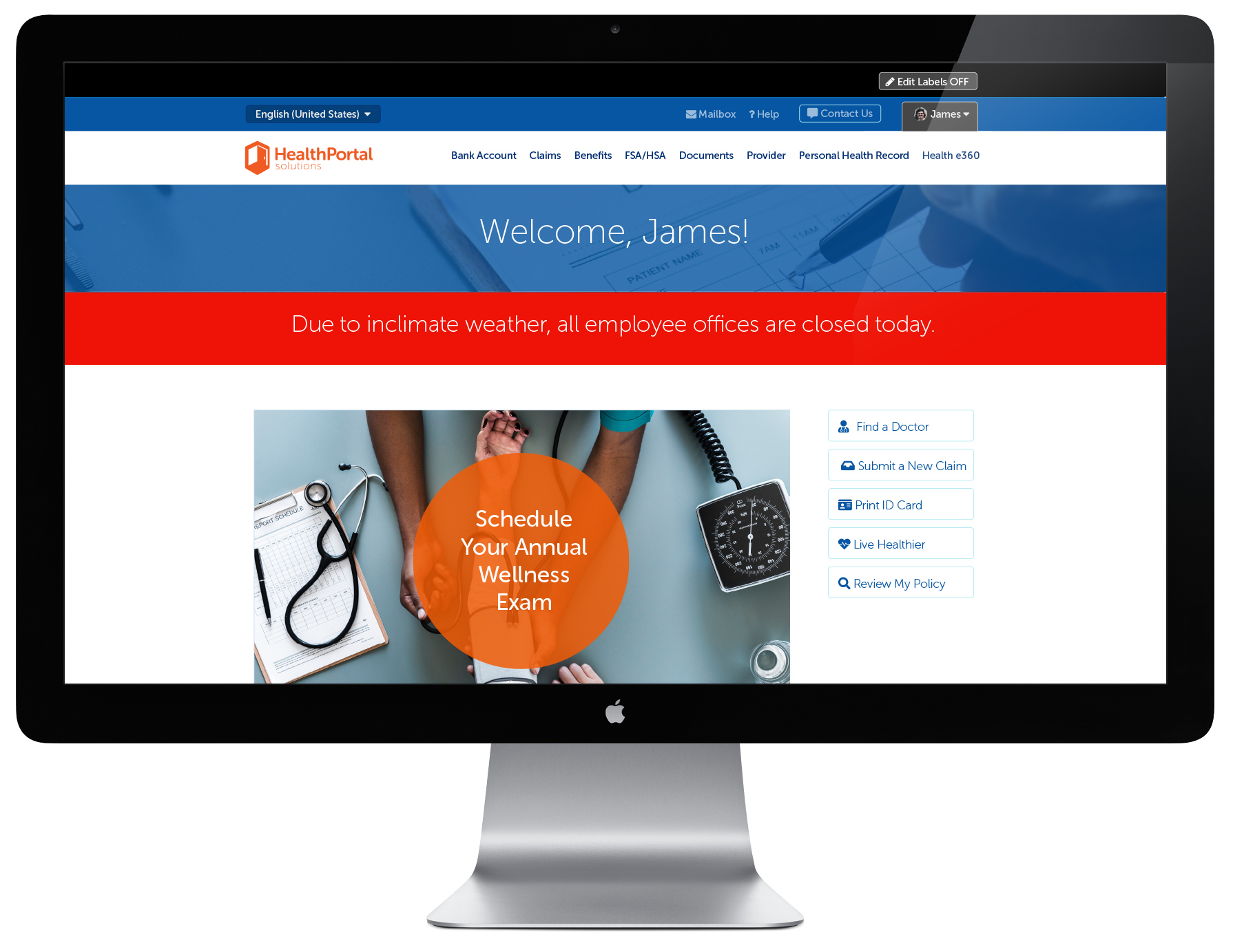
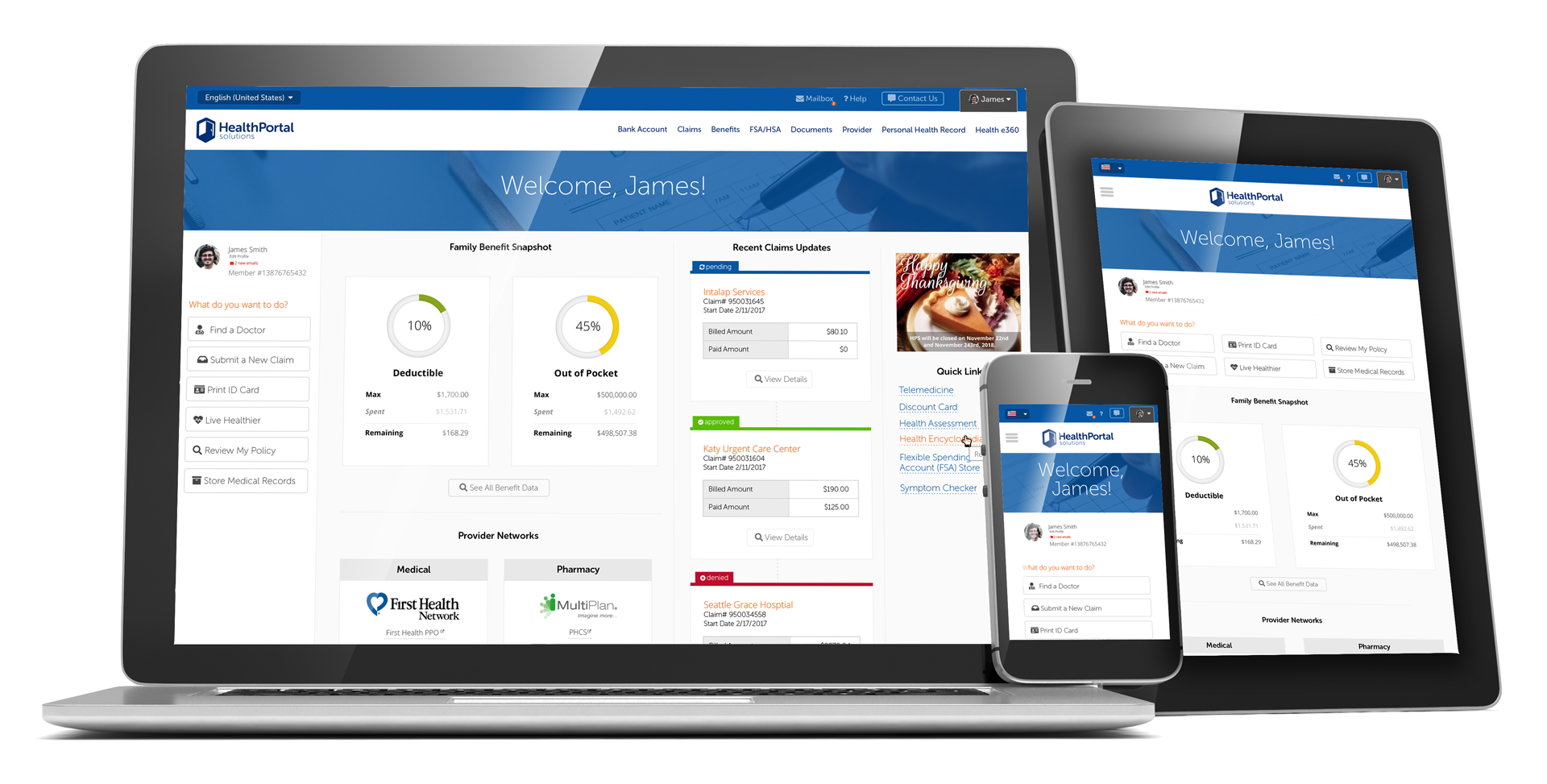
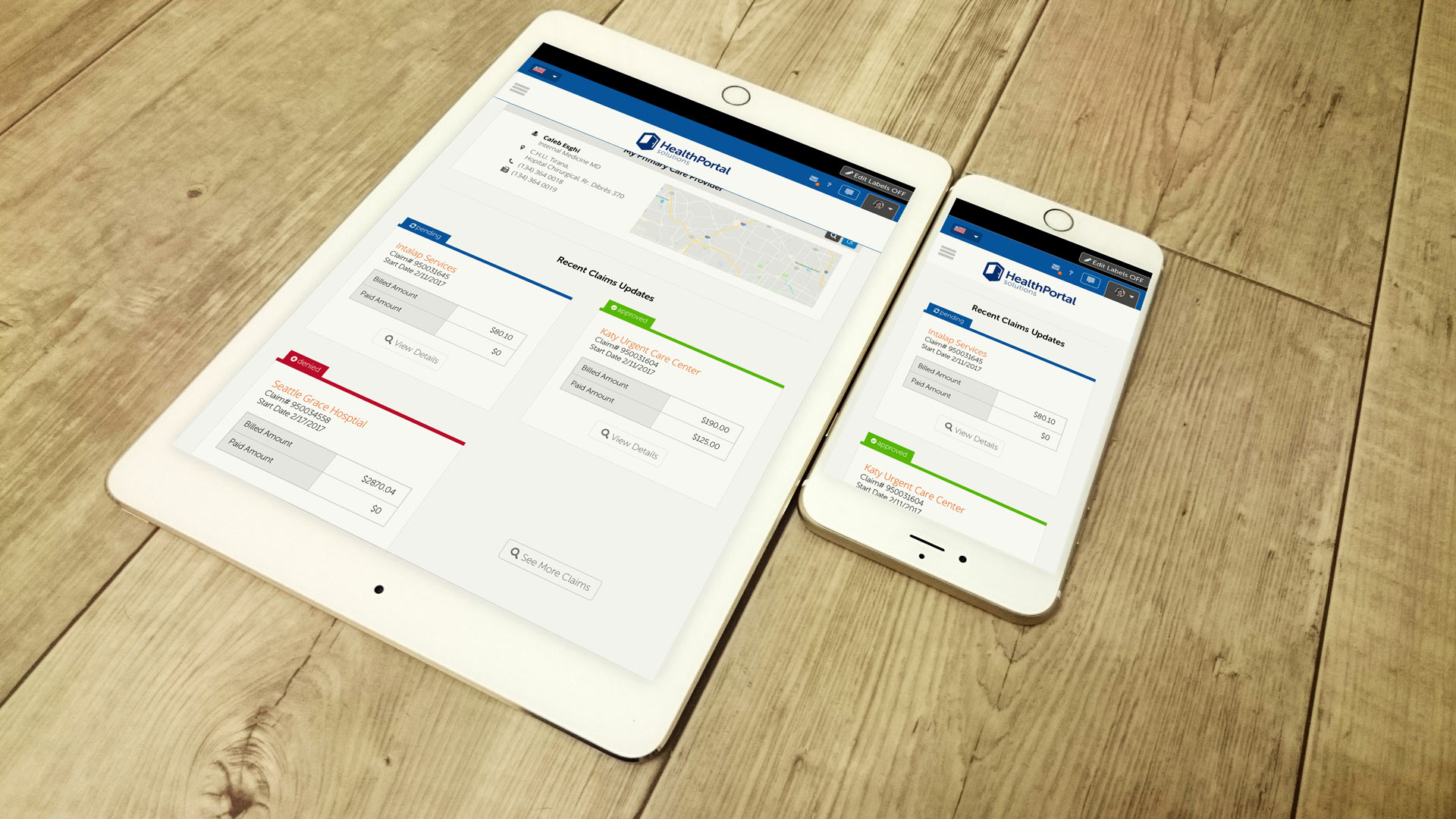
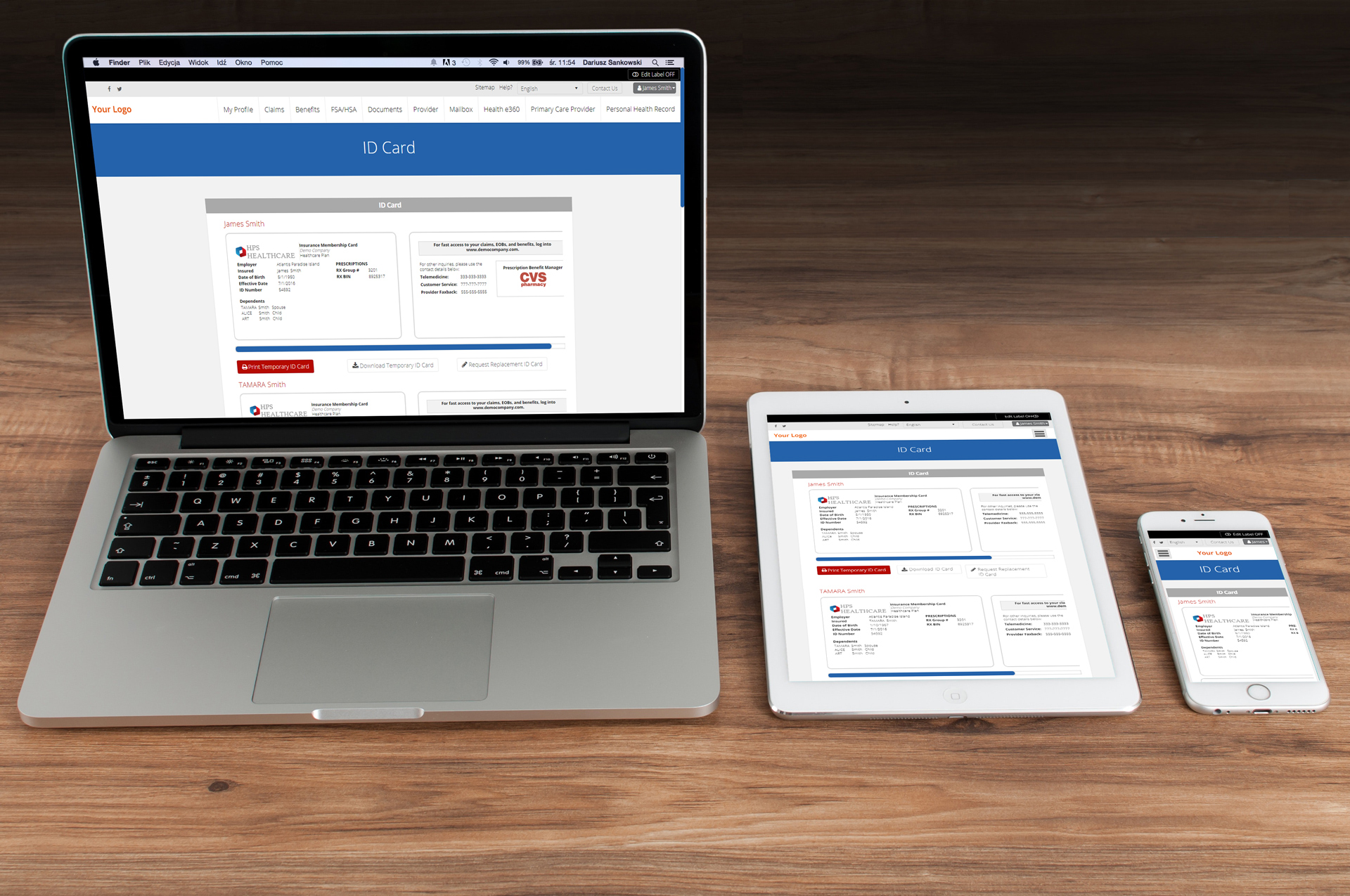
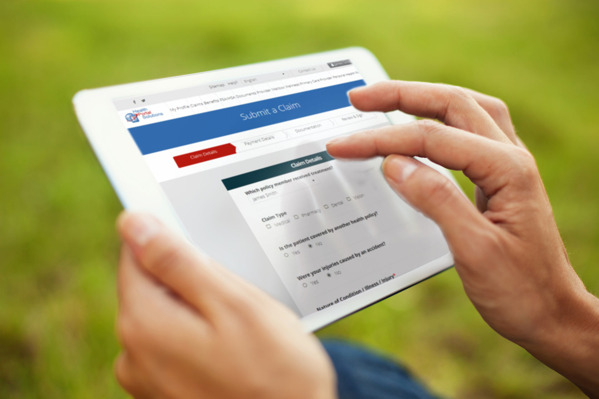
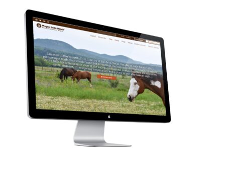
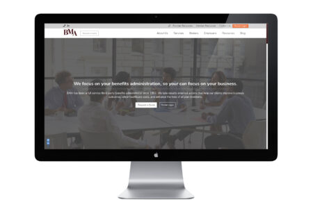
Different clients that licensed the portal had different needs and expectations. HPS needed interfaces that could be easily customized to different client needs, between basic designs, or highly customizable appearances. I designed these options for the Member Dashboard screens, where options such as page width, navigation width, primary/secondary/tertiary colours, background imagery and different ‘widget’ spots could be turned on or off.
Some clients wanted a simple, bare minimum home screen.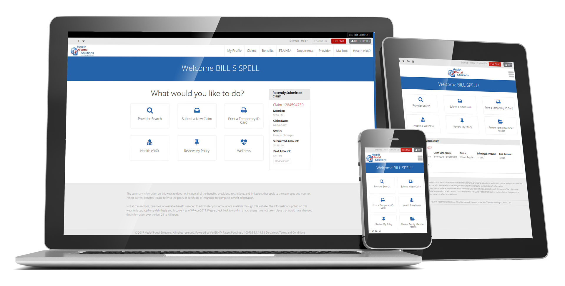
Some clients wanting to be able to put much marketing graphics in front of the user.
While other clients wanted to display relevant data specific to each website member.


