Natalie Sanchez – Hair Dresser
Overview
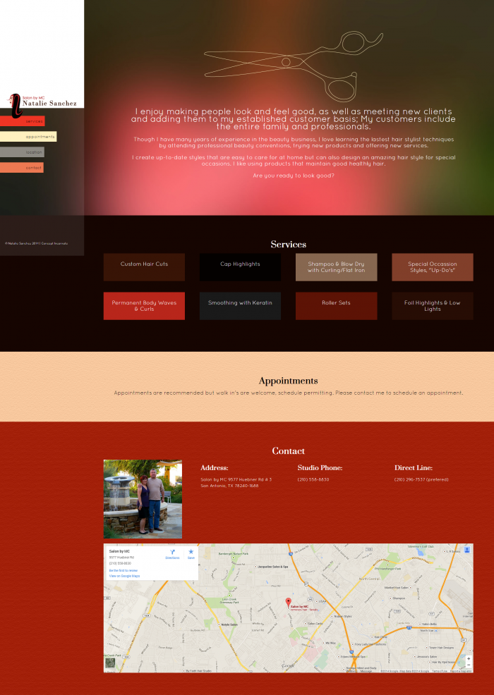
This was a small budget website for a hair dresser that wanted to appeal to a younger audience. I used dark, rich colours to mimic the high-end quality of the services performed by the client. I also took inspiration from human hair colours. The client is not someone who uses social media or checks email very often so she did not want to offer that type of communication/ connection on the website. I also decides to keep the programming simple as the client never planned to make updates to the website herself and decided to keep the website to a 1 page HTML5 site, rather that using a full-blown WordPress site. Since there is not a lot of content, I spread out the content the client did offer and tried to dress it up to have a prestigious presentation.


