Portal Mail UI Overhaul and WCAG 2.1AA Design Compliance
Overview
The existing mailbox UI evolved beyond its planned scope.
Originally, it was never meant to be an email system, in fact, the IT Director said it should not be used in such a way. The IT Director retired, and staff changed, and clients wanted to have a full blast emailing system, not just a “one-way send a message option.”
Over time, the business analysts added more features to what was now the email system. Each addition added functionality, but without a grand vision, the features were just shoved into place, wherever they could fit.
To further confusion, the Administrator UI was in an older framework, not in the responsive design framework like the Member/Employer/Healthcare Provider portals, so this led to 2 different design shells.
As part of the team’s initiative to make the health portals WCAG 2.1 AA compliant, I decided it would be a good chance to refine the mailbox UI. I first designed the desktop view, then a mobile size view, and bounced in between them.
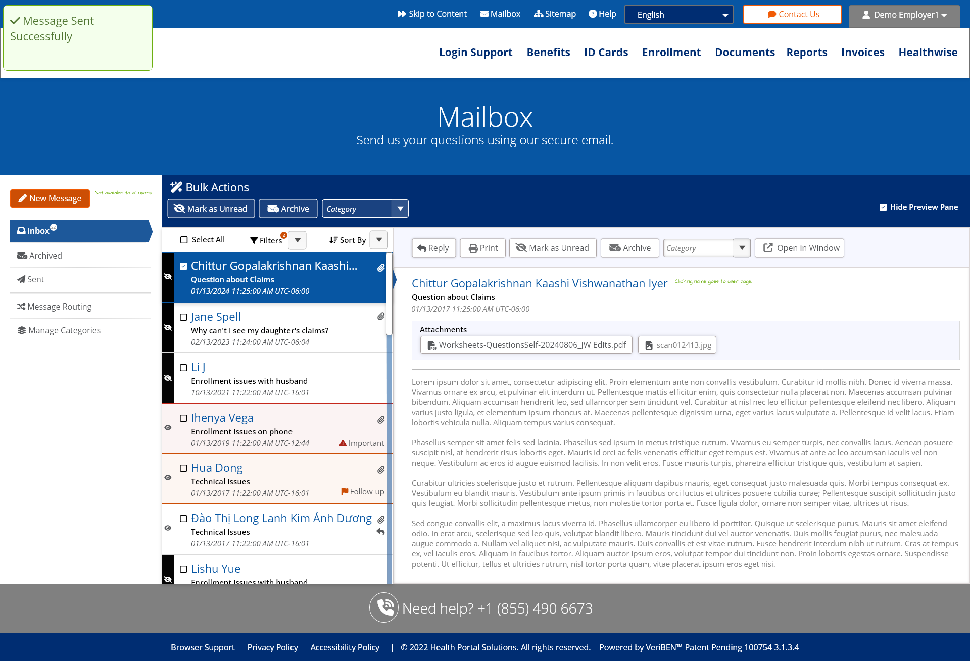
I thought how the old system put message flags and folder selection under the same icon, it made things very confusing. The search and filtering of messages was lacking. The display of messages in a grid, looked very much like something a programmer would dream up, rather than a non-tech user. Also, the mobile CSS was very rushed, and looked like it was not planned out.
I added in:
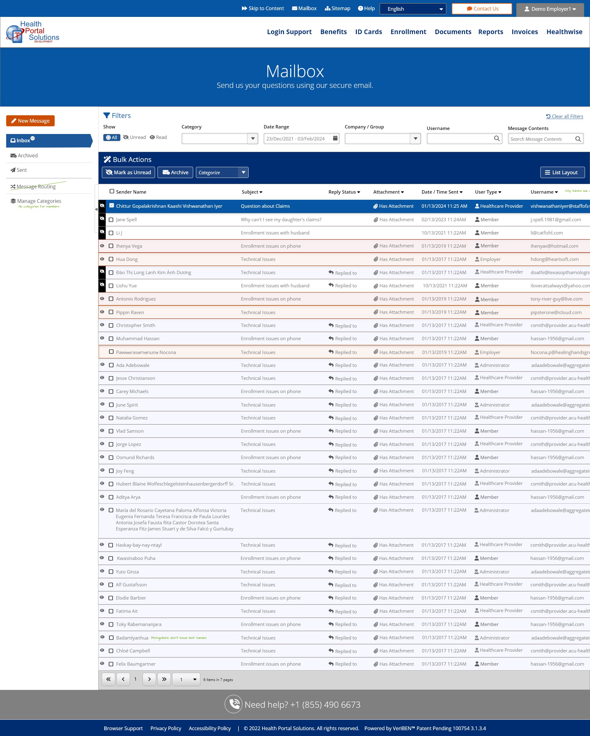
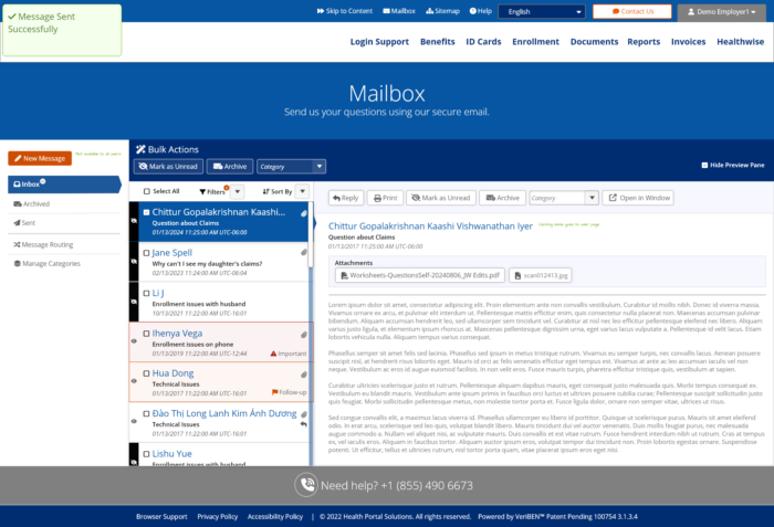
• a clear way to filter messages.
• A clear way to sort messages.
• A clear way to mark messages as archived.
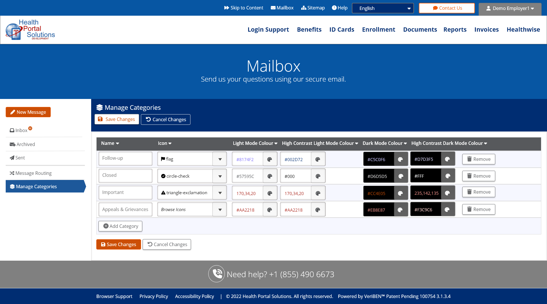
• I re-named “flags” to be “Categories” as a category could be any user-chosen label such as “Follow-up,” “Closed,” or “Important.” The word “Flag” seemed to imply action was required. I also let the user decide what icon to pair with the categories.
• I allowed for the message to be popped out into it’s own window.
• I put labels on all buttons. I found when spending time with my elder uncle, icons that seemed obvious to younger people did not make sense to him. This highlighted to me that we should not assume people will understand an icon; each icon must be paired with a clear label.
• I gave the users the option to toggle between a Grid Layout and a List Layout for viewing messages. This would satisfy the common users and the power users.
After the team had bought into the Desktop and iPhoneX designs, I went ahead and mocked up a similar Tablet and 320px width, so these can be clearly laid out for the developers, and for the QA team to have less judgement calls on what would be acceptable to release.
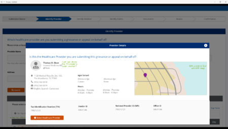
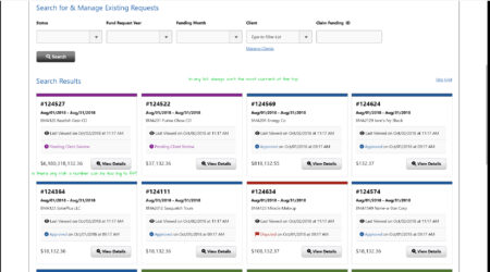
A Few Screenshots
See the Prototype Links Here:
Desktop UI: https://xd.adobe.com/view/1fb0284c-267a-4961-bd21-b7f6e86b8d5c-4ae3/
iPad UI: https://xd.adobe.com/view/5882e853-7f19-42a9-863b-4b4d80127d94-0dd1/
iPhoneX UI: https://xd.adobe.com/view/bb02109b-3e58-4af5-94b2-8a21483ed9ab-ee51/
320px Wide UI: https://xd.adobe.com/view/b41880e0-d28f-4ae3-96e4-0bb7ee69b616-e14b/

