Wedding Savings Website
Overview
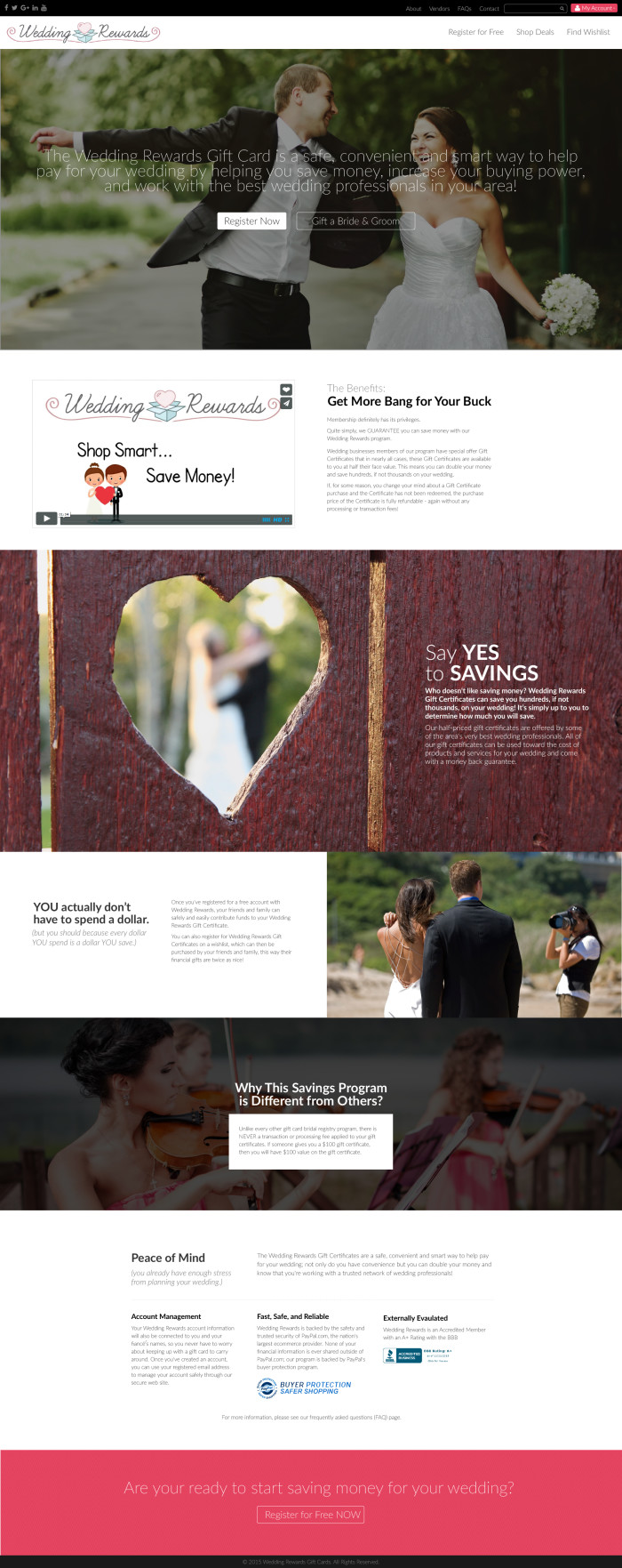
This was designed for another company that was looking to bring their look into today’s style. I used over-sized images, bold, vibrant colours and a thin, modern font to appeal to a bride in the late twenties or early thirties.
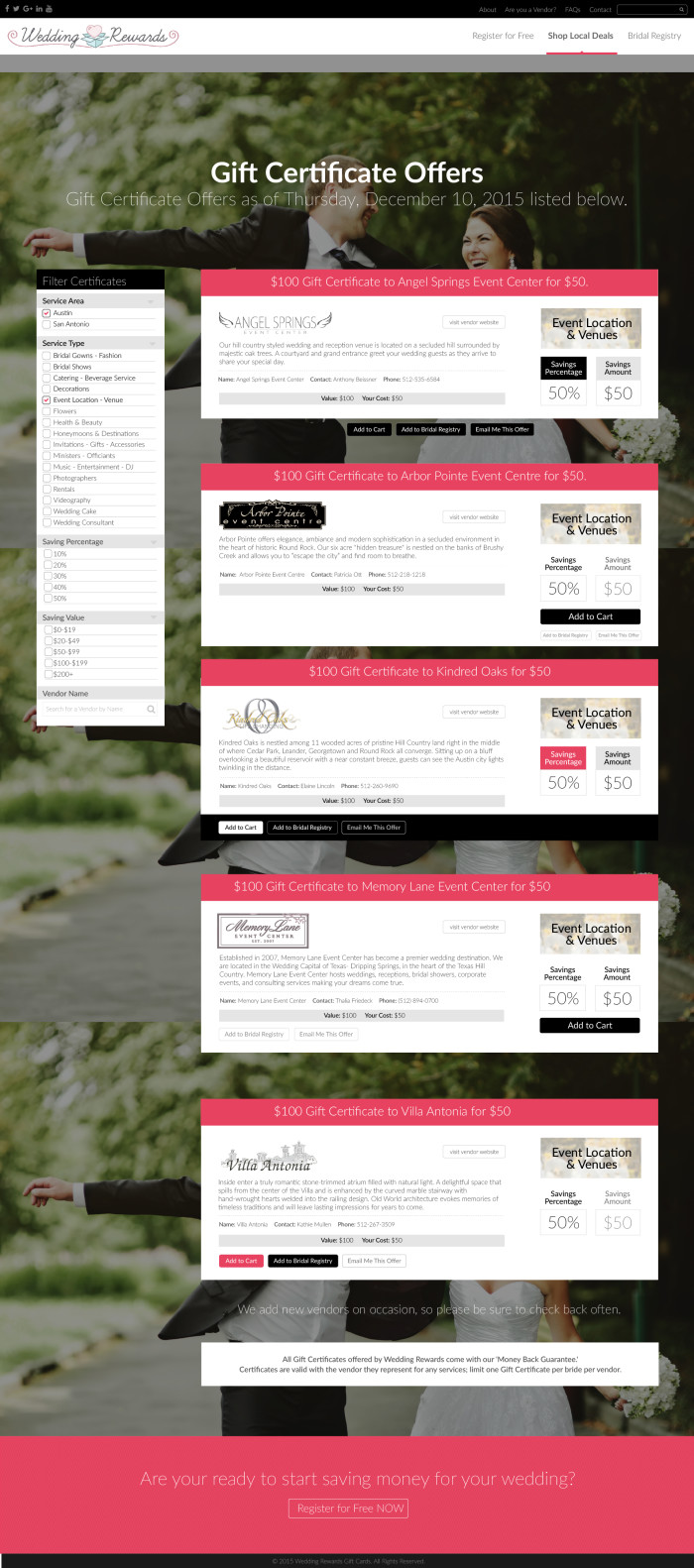
I am showing the secondary page to show the different style/presentation options that I offered to the client. I also wanted to show the advantage of designing with real content, rather than filler-text, as you can accurately portray the way the content will affect the final design.
Services
Front-End Development / Responsive Design / User Interface / web design / Website Design


